par(mfrow = c(2,2))
plot(penguins$bill_length_mm,
penguins$body_mass_g,
xlab = "Bill Length(mm)",
ylab = "Body Mass(g)")
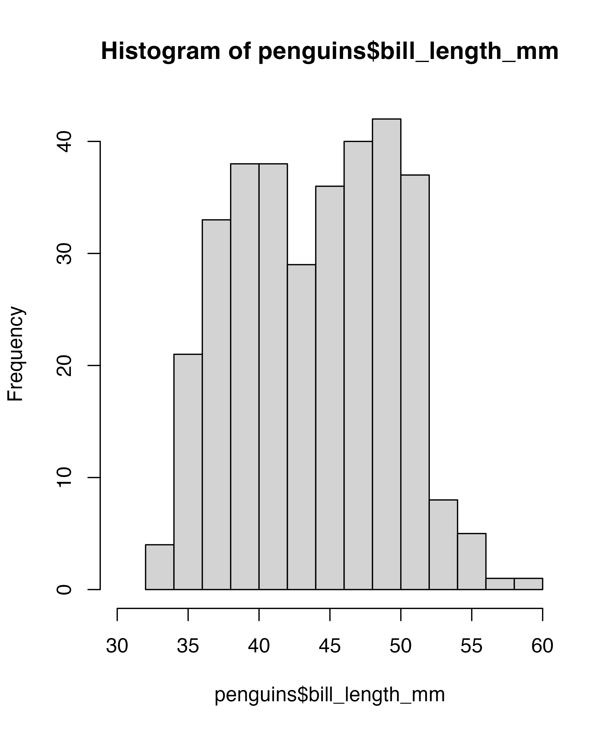
hist(penguins$bill_length_mm,
xlim = c(30, 60))
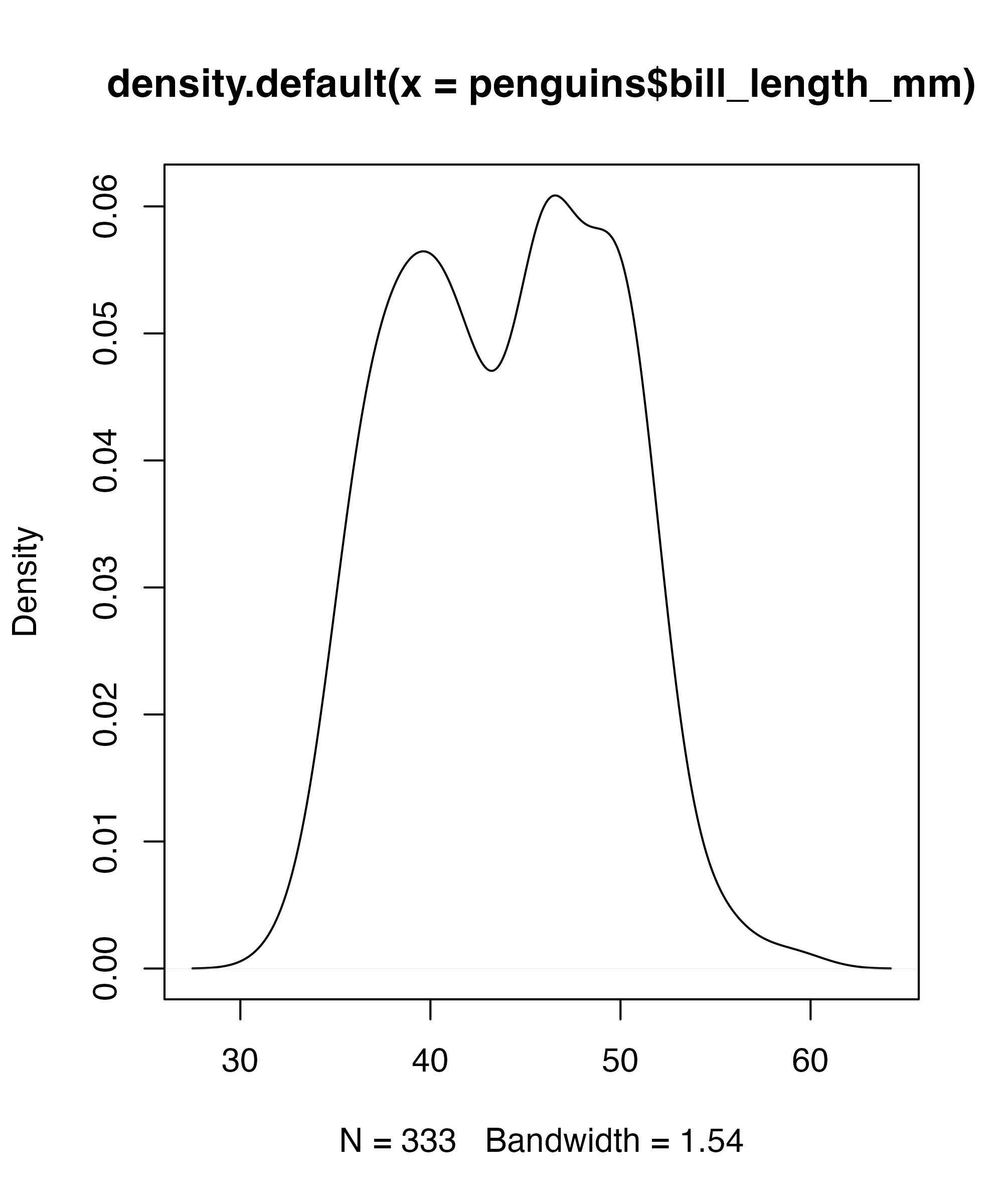
plot(density(penguins$bill_length_mm))
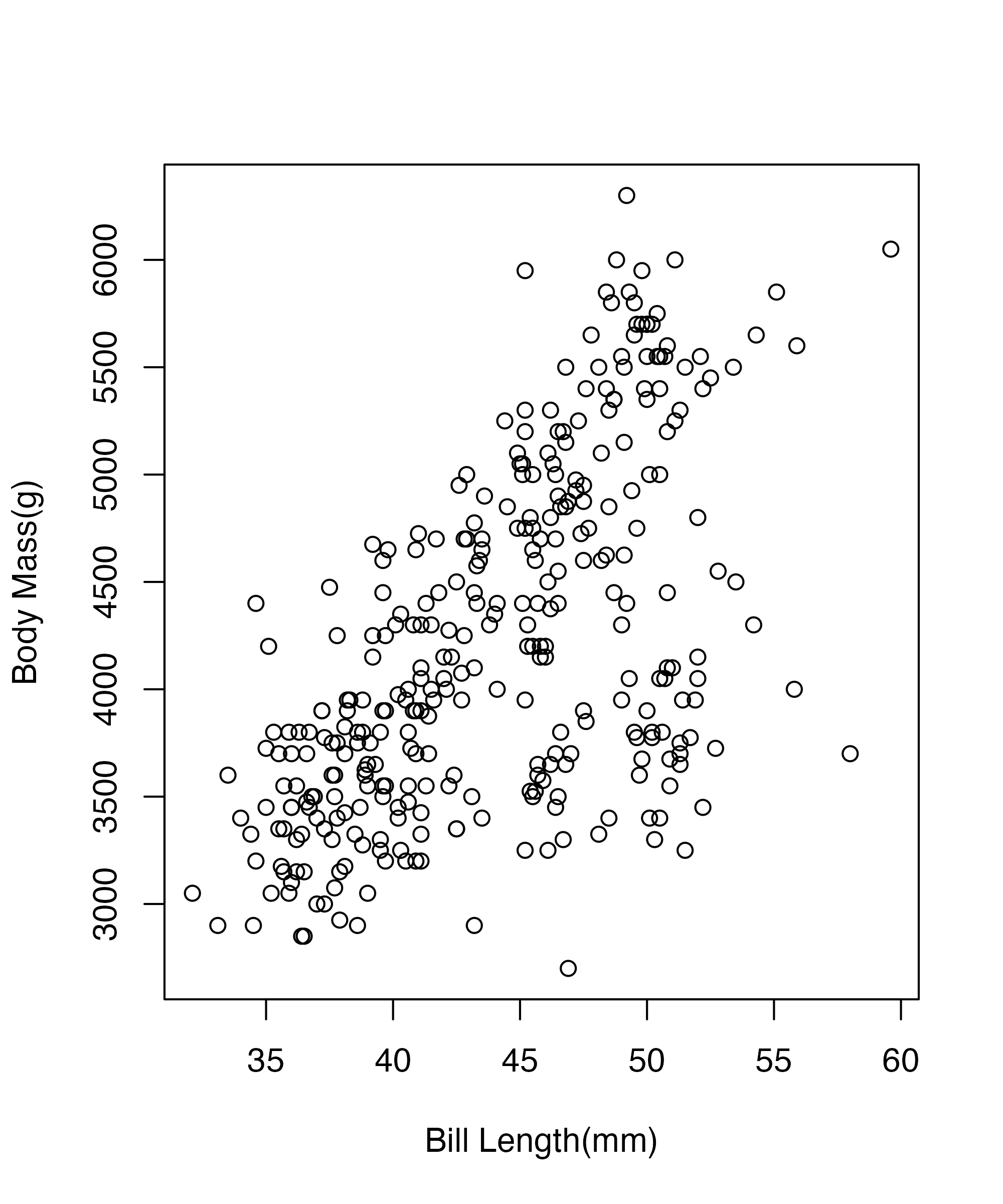
plot(penguins$bill_length_mm,
   penguins$body_mass_g,
   xlab = "Bill Length(mm)",
   ylab = "Body Mass(g)")
abline(lm(body_mass_g~bill_length_mm, data = penguins))Getting Started in ggplot
8/29/22
Where We Have Been
Expanding What We Know

Our Team

Get Ready Badges

How To Get the Badges
The Dino Strikes

Grammar
“Good grammar is just the first step of creating a good sentence”
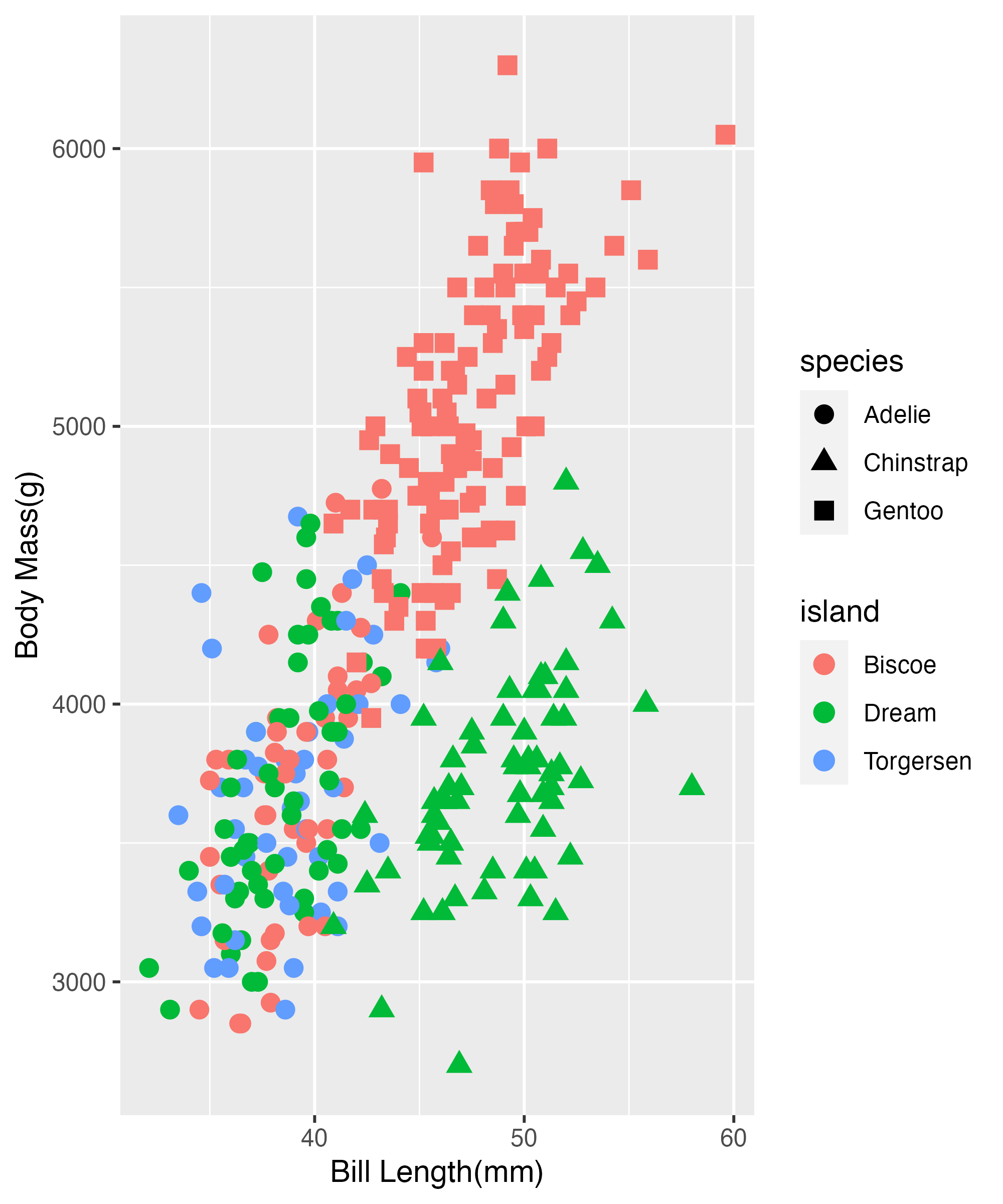
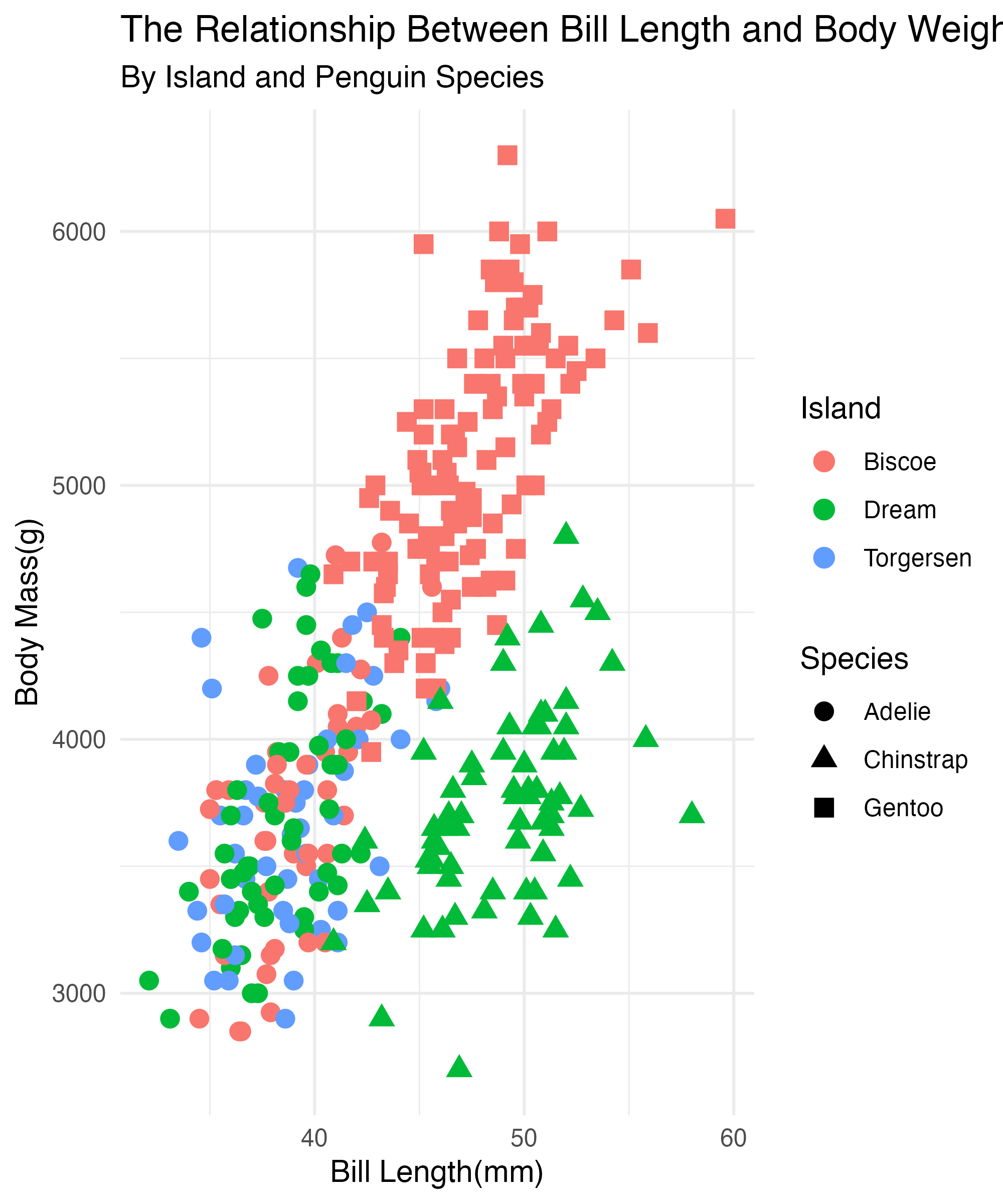
- How is the data related to the figure on the right?

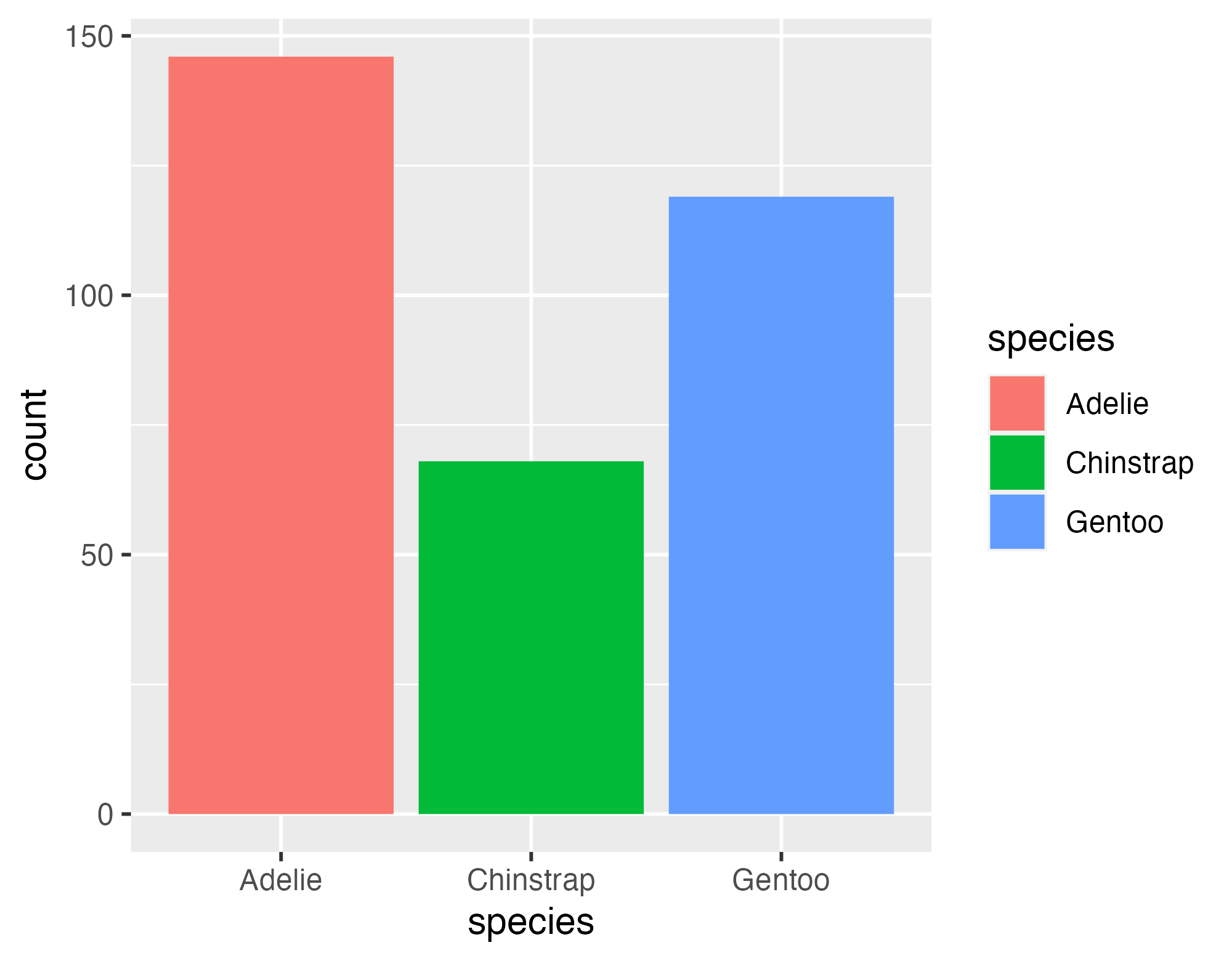
Building the Plot
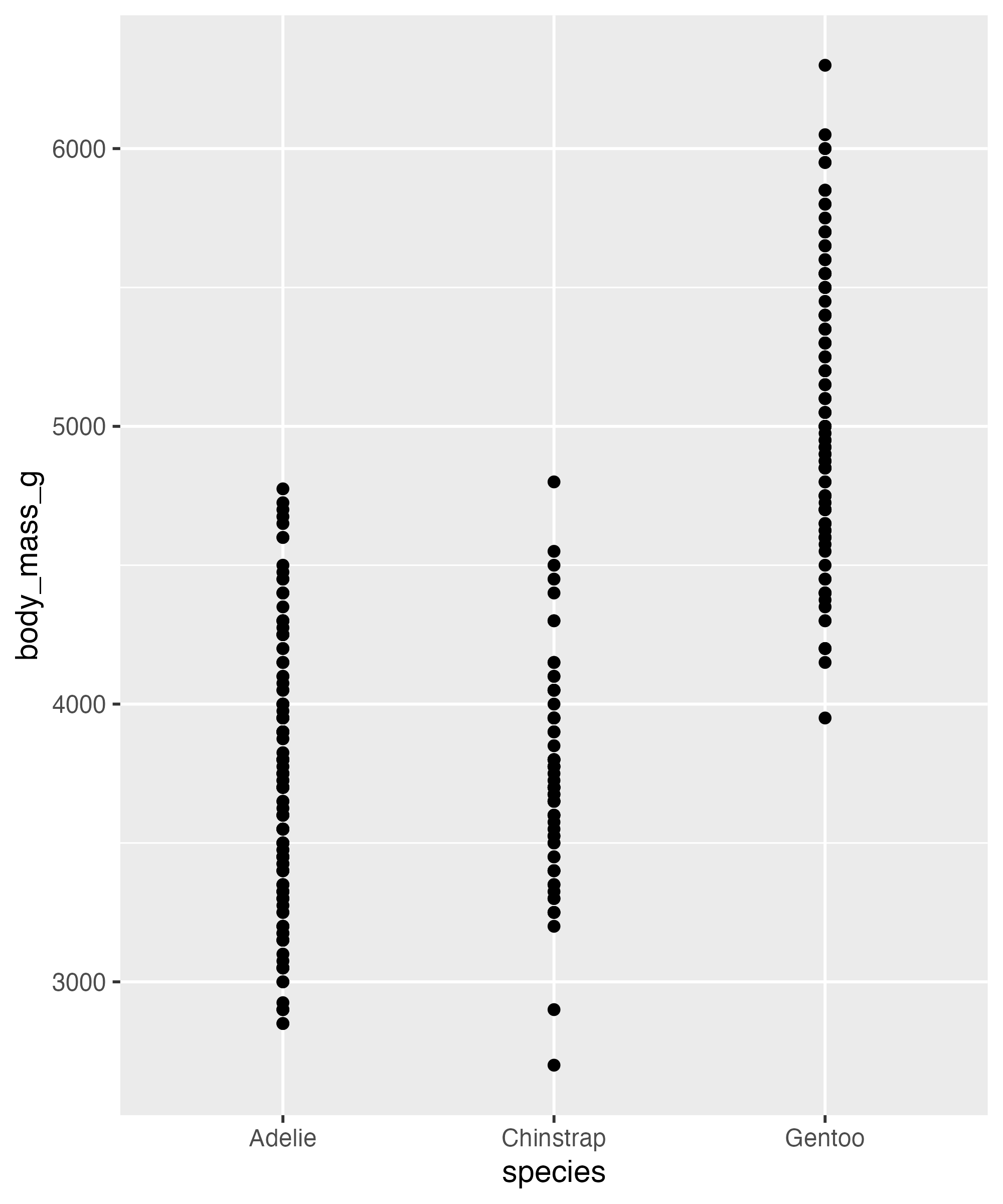
Body Weight of Penguins and Bill Length
Penguins
Species
Island

Building the Plot
Body Weight of Penguins and Bill Length
Penguins
Species
Island
Building the Plot
Body Weight of Penguins and Bill Length
Penguins
Species
Island

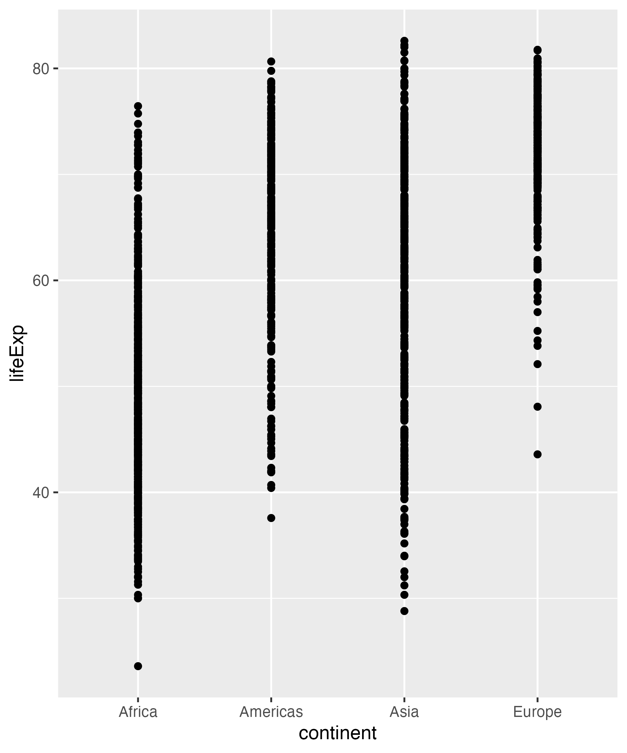
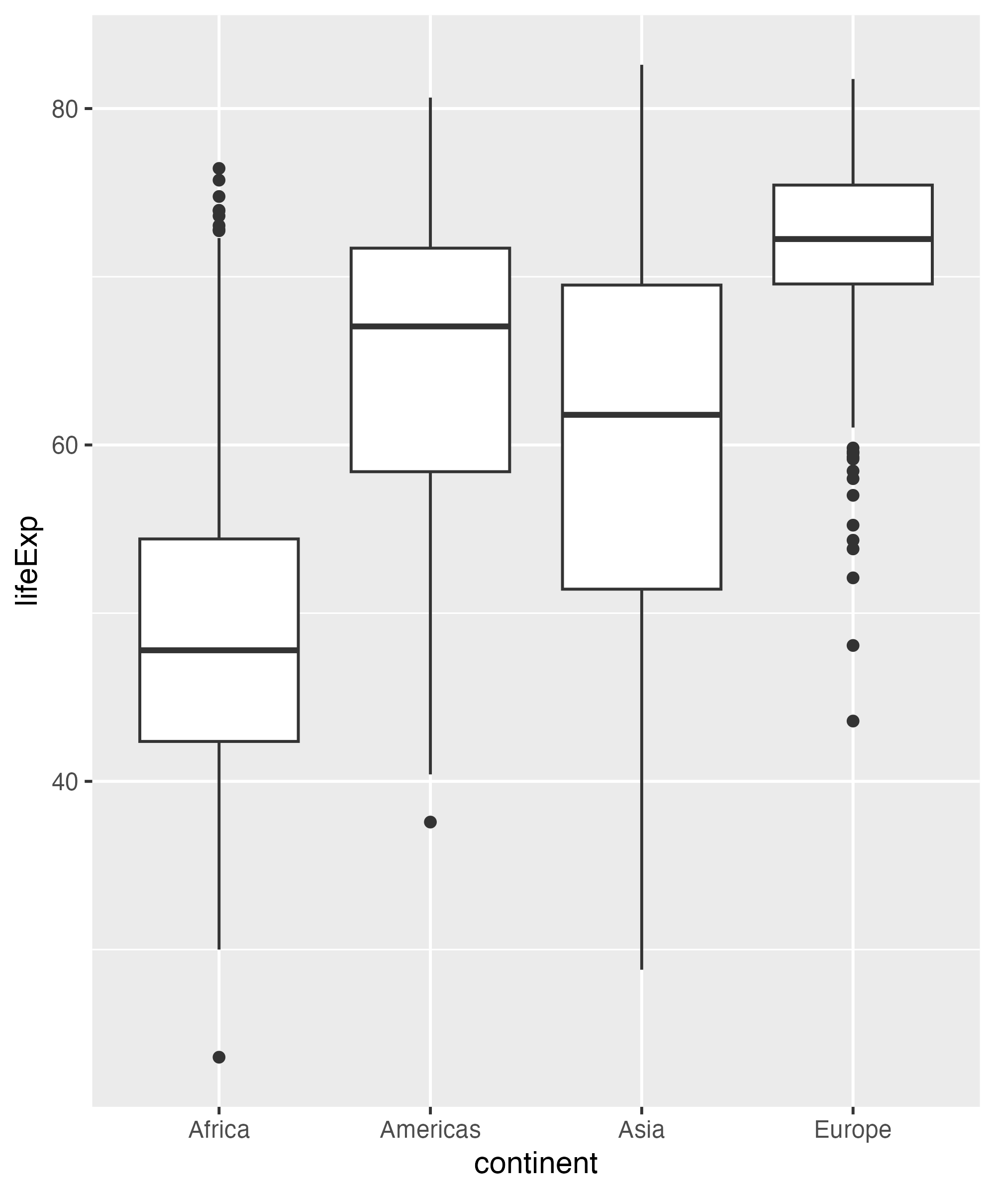
So How Did We go From?
This
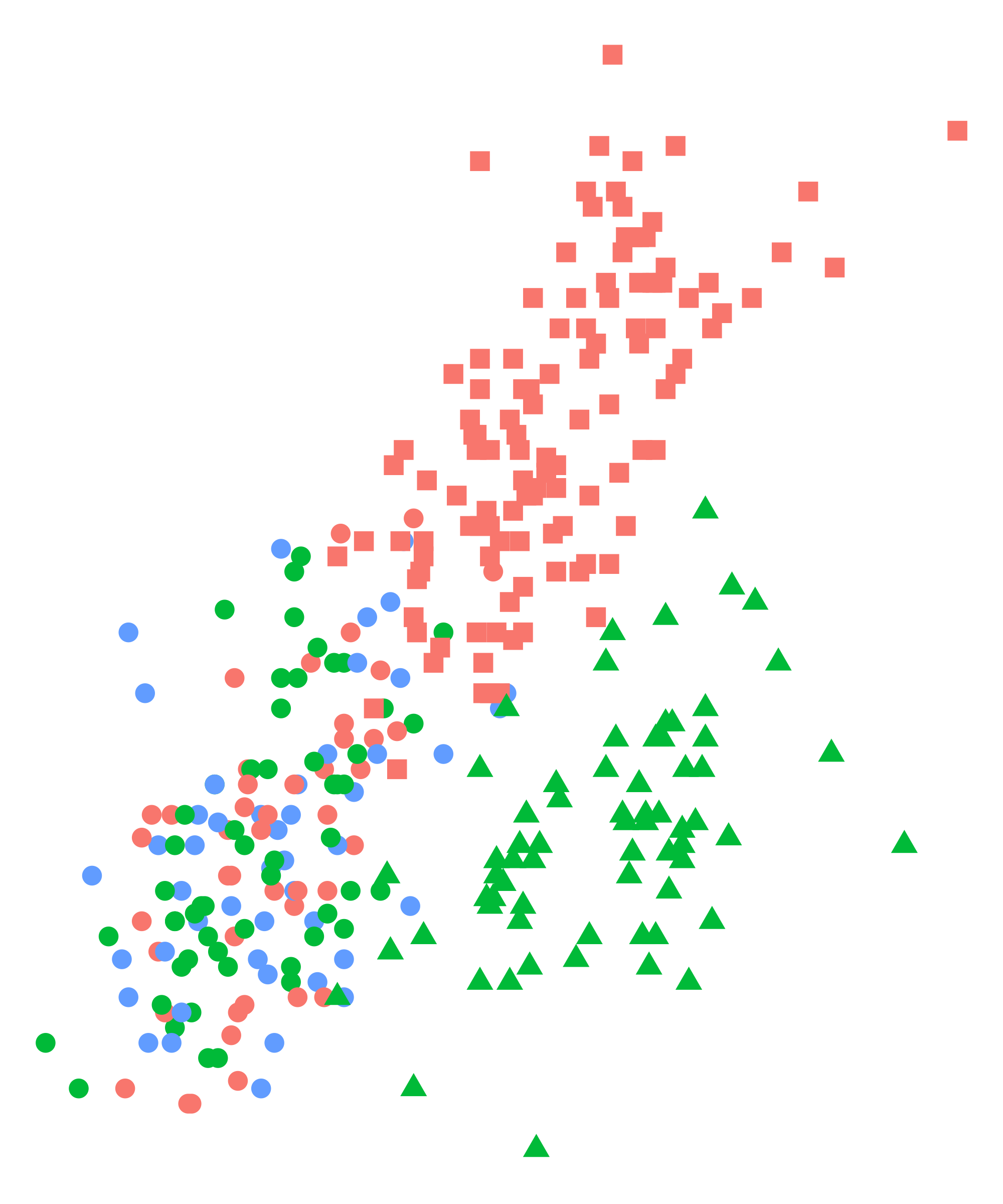
To This
Where do they go?

How would you make this plot?


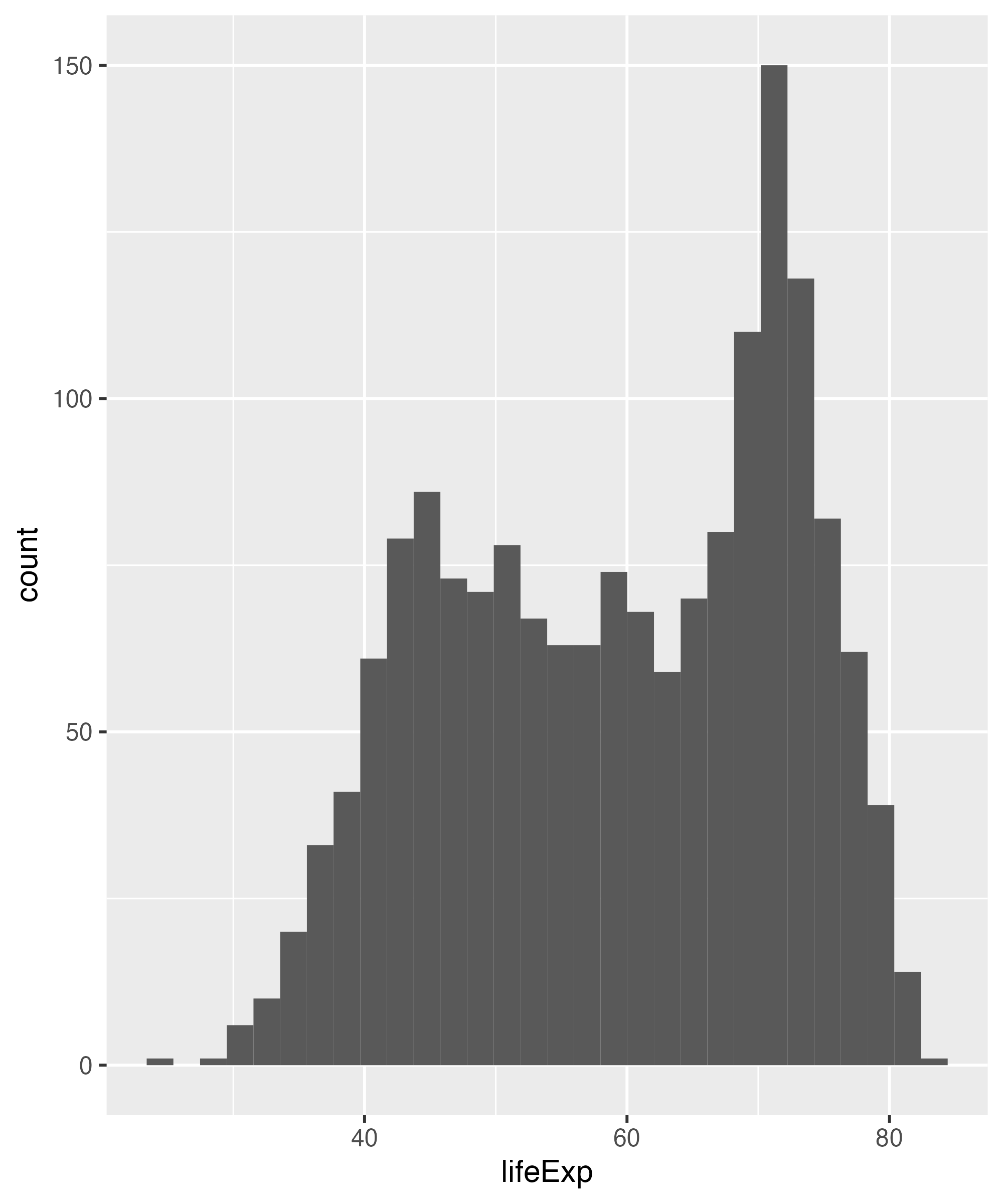
Same options different stuff


Example(sort of)

Your Turn

02:00
Answer
Your Turn Again
Hint do not supply a Y value
02:00

Your Turn
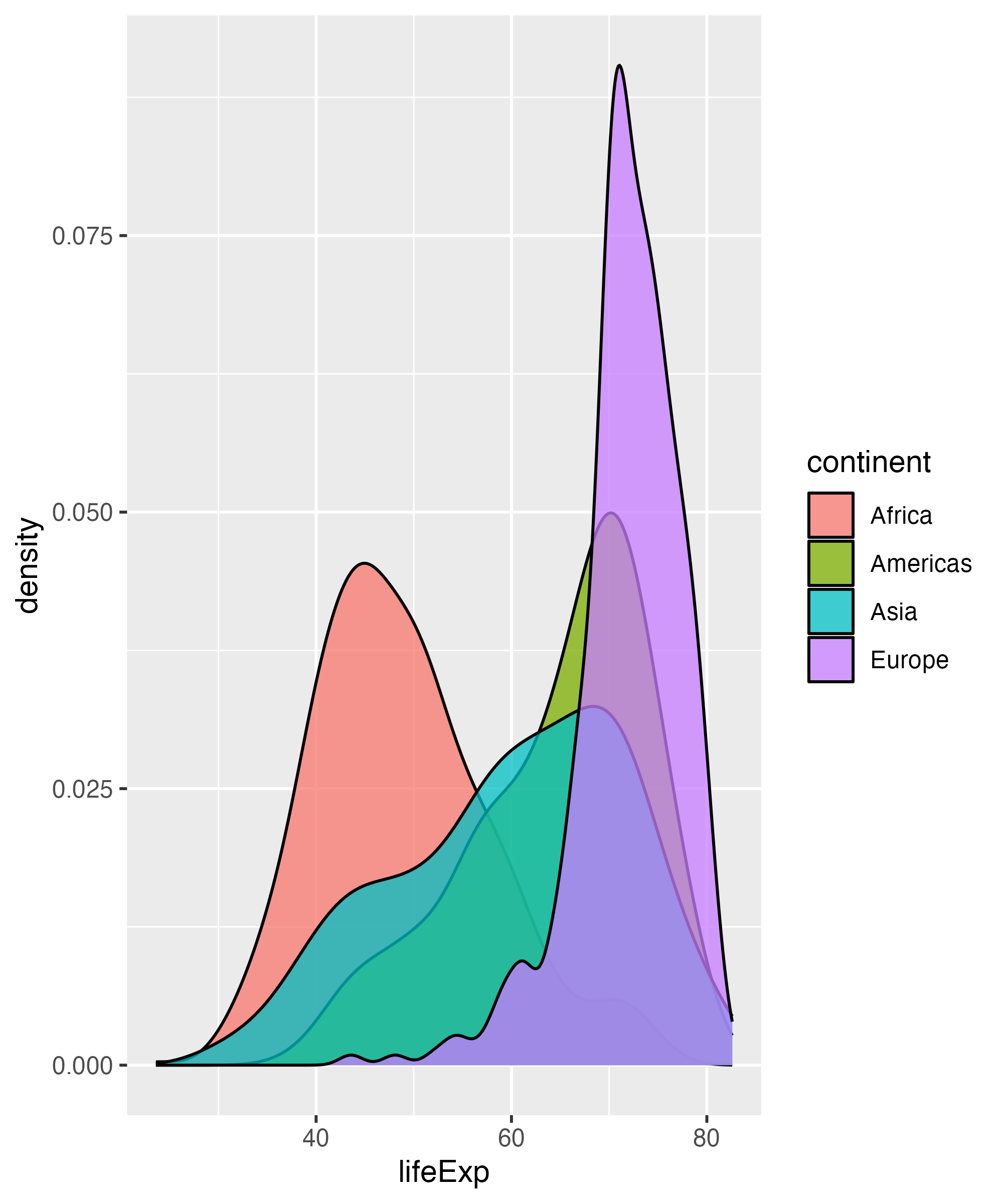
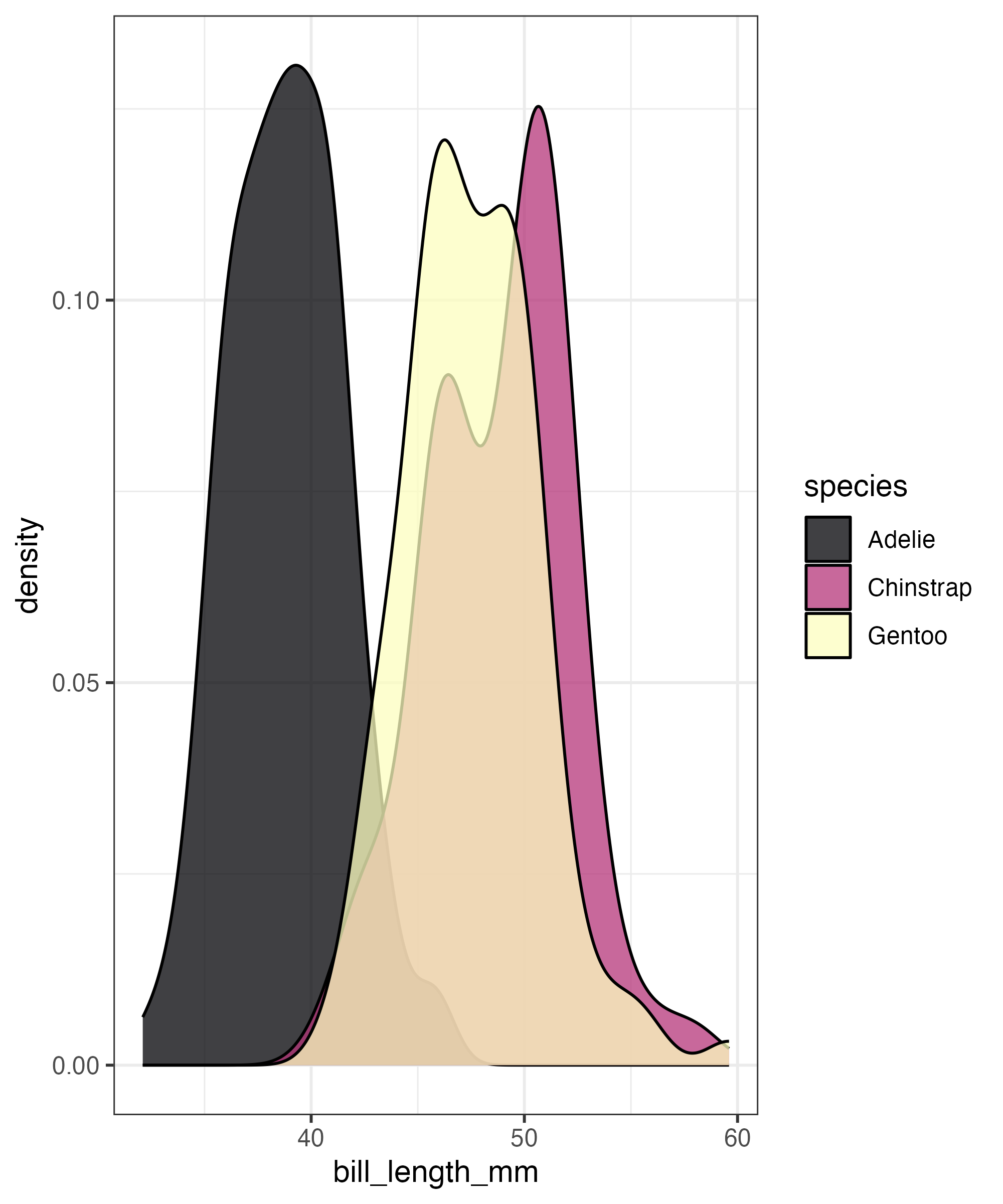
Make This Density Plot filled by continent

02:00
Complex graph!
Local
Global

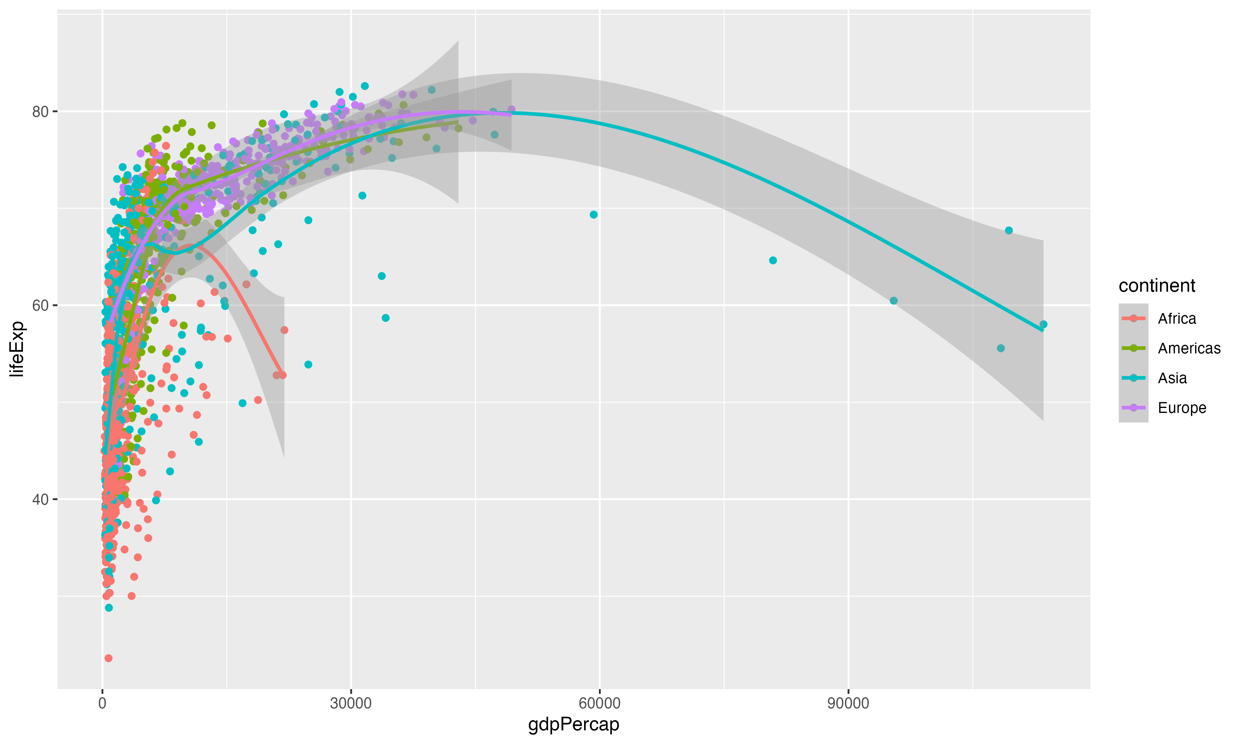
Building Plots
Starting with Data and aesthics
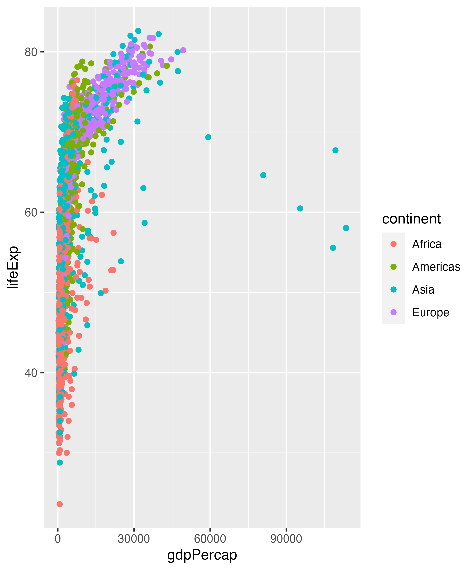
Add geom_point
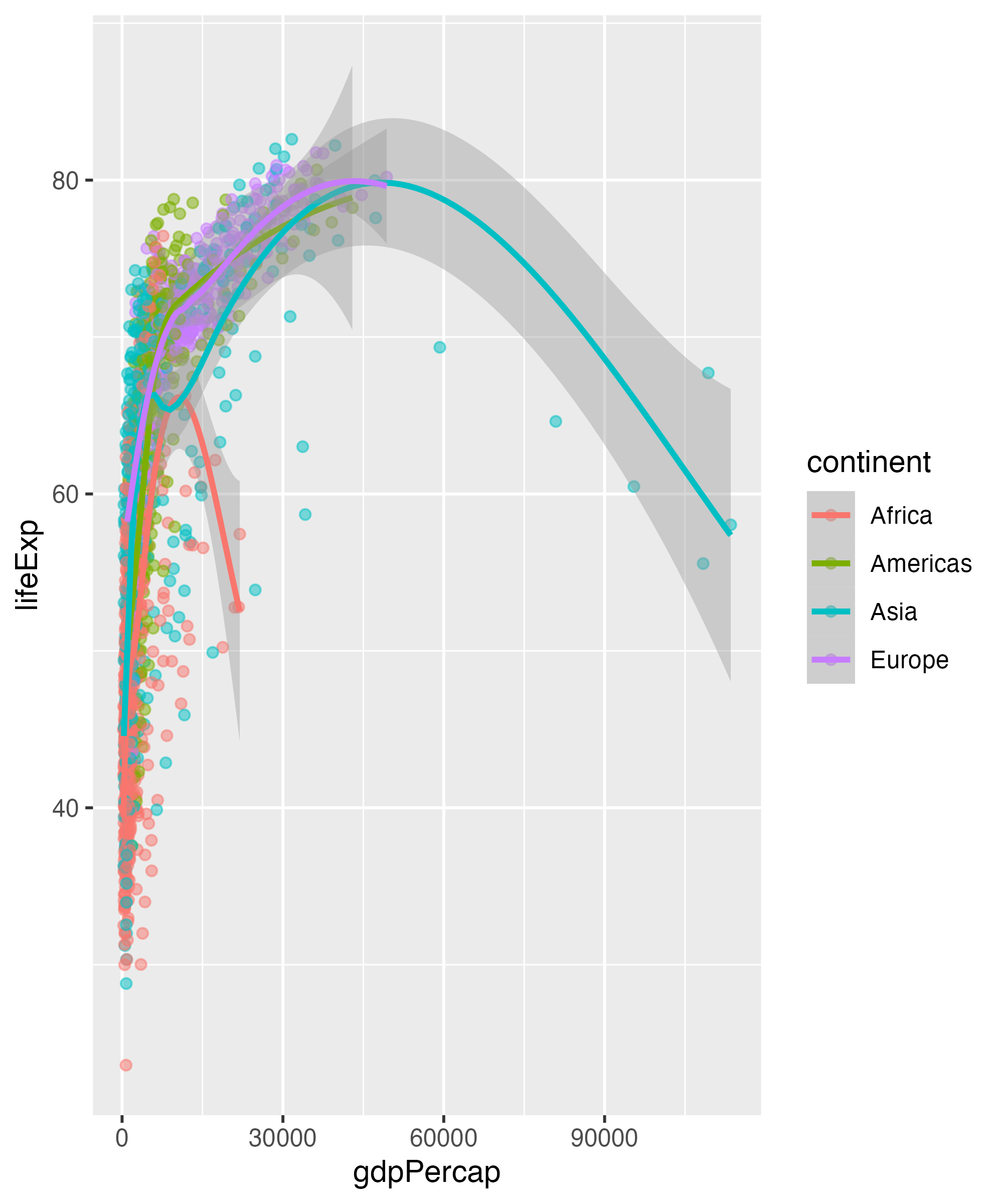
Add geom_smooth

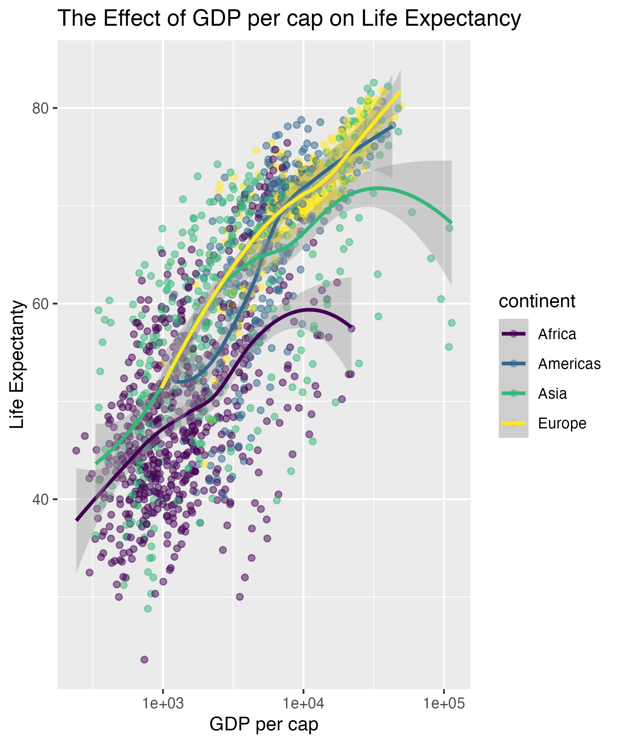
Change Transparency
Adjust scales with scale_x_log10

Add axis labels and title with labs

Add viridis color scale
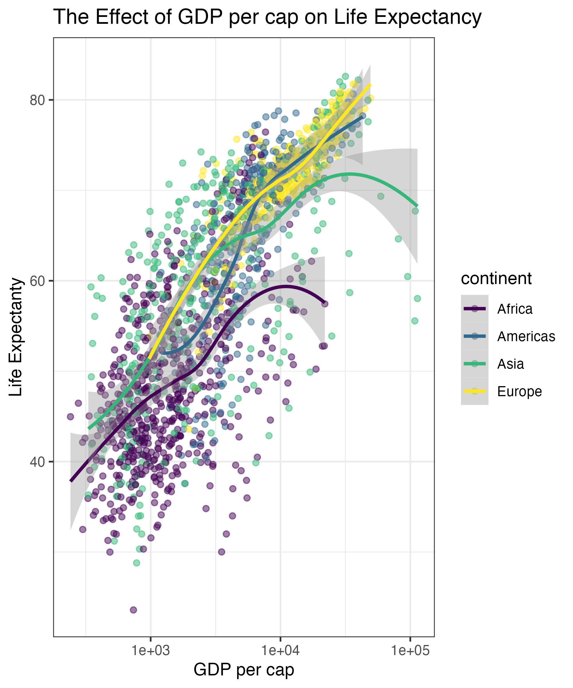
Add theme
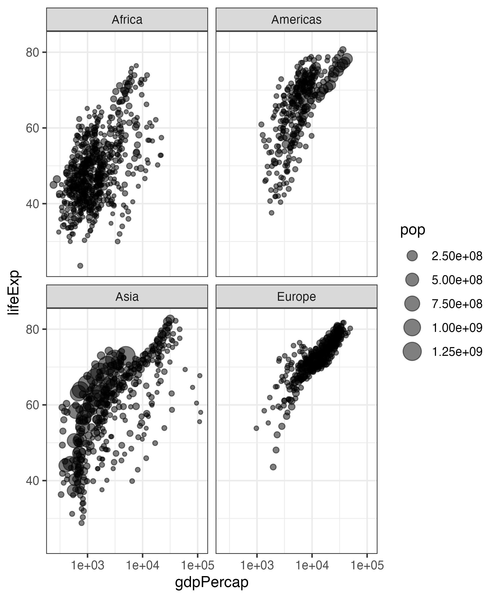
Facet by Continent
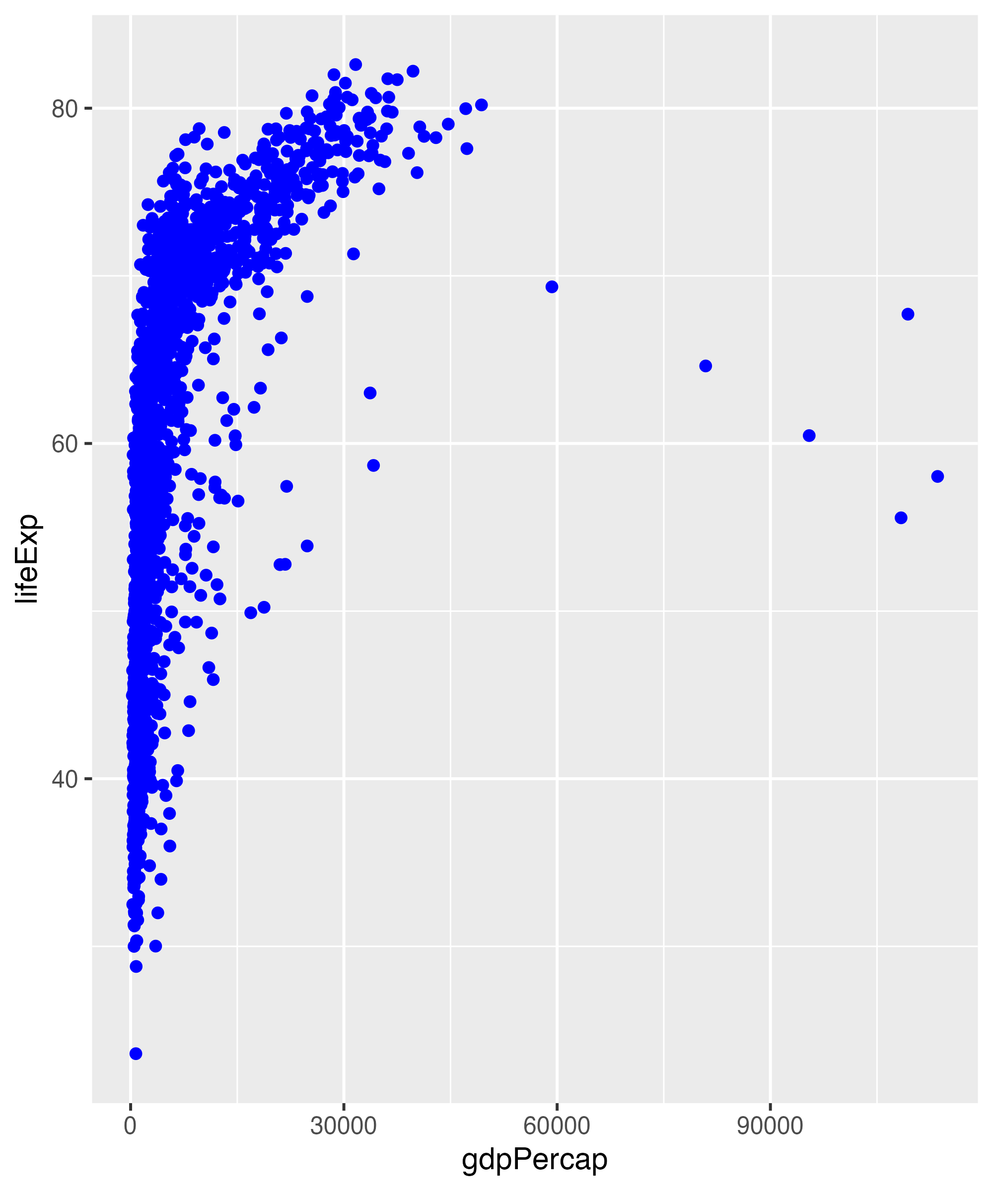
ggplot(gapminder,
    aes(x = gdpPercap,
       y = lifeExp,
       color = continent)) +
  geom_point(alpha = 0.5) +
geom_smooth() +
scale_x_log10() +
labs(x = "GDP per cap",
y = "Life Expectanty",
title = "The Effect of GDP per cap on Life Expectancy") +
scale_color_viridis_d() +
theme_bw() +
facet_wrap(vars(continent))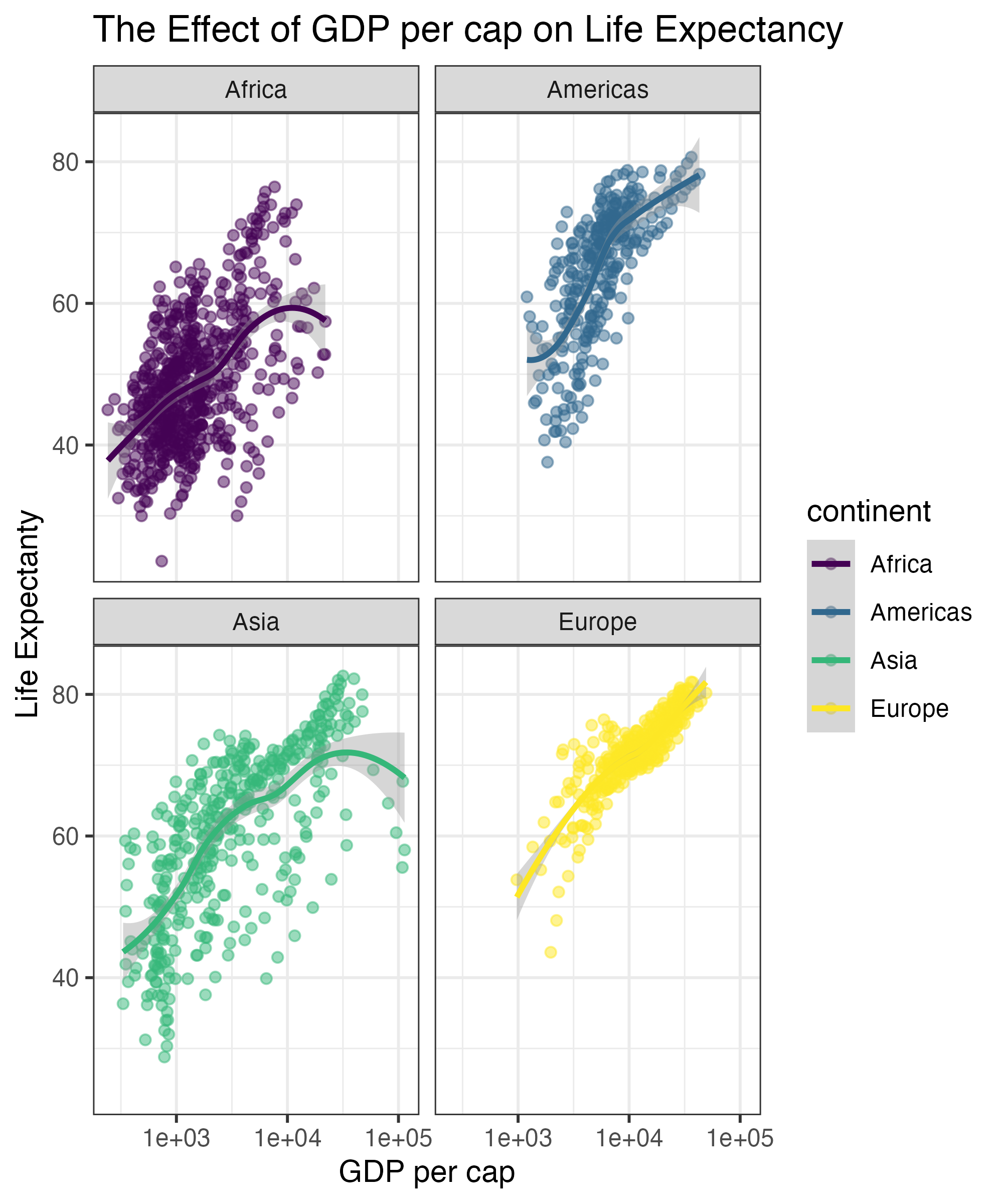
Change Theme Options
ggplot(gapminder,
     aes(x = gdpPercap,
         y = lifeExp,
         color = continent)) +
  geom_point(alpha = 0.5) +
  geom_smooth() +
scale_x_log10() +
labs(x = "GDP per cap",
y = "Life Expectanty",
title = "The Effect of GDP per cap on Life Expectancy") +
scale_color_viridis_d() +
theme_bw() +
facet_wrap(vars(continent)) +
theme(legend.position = "none")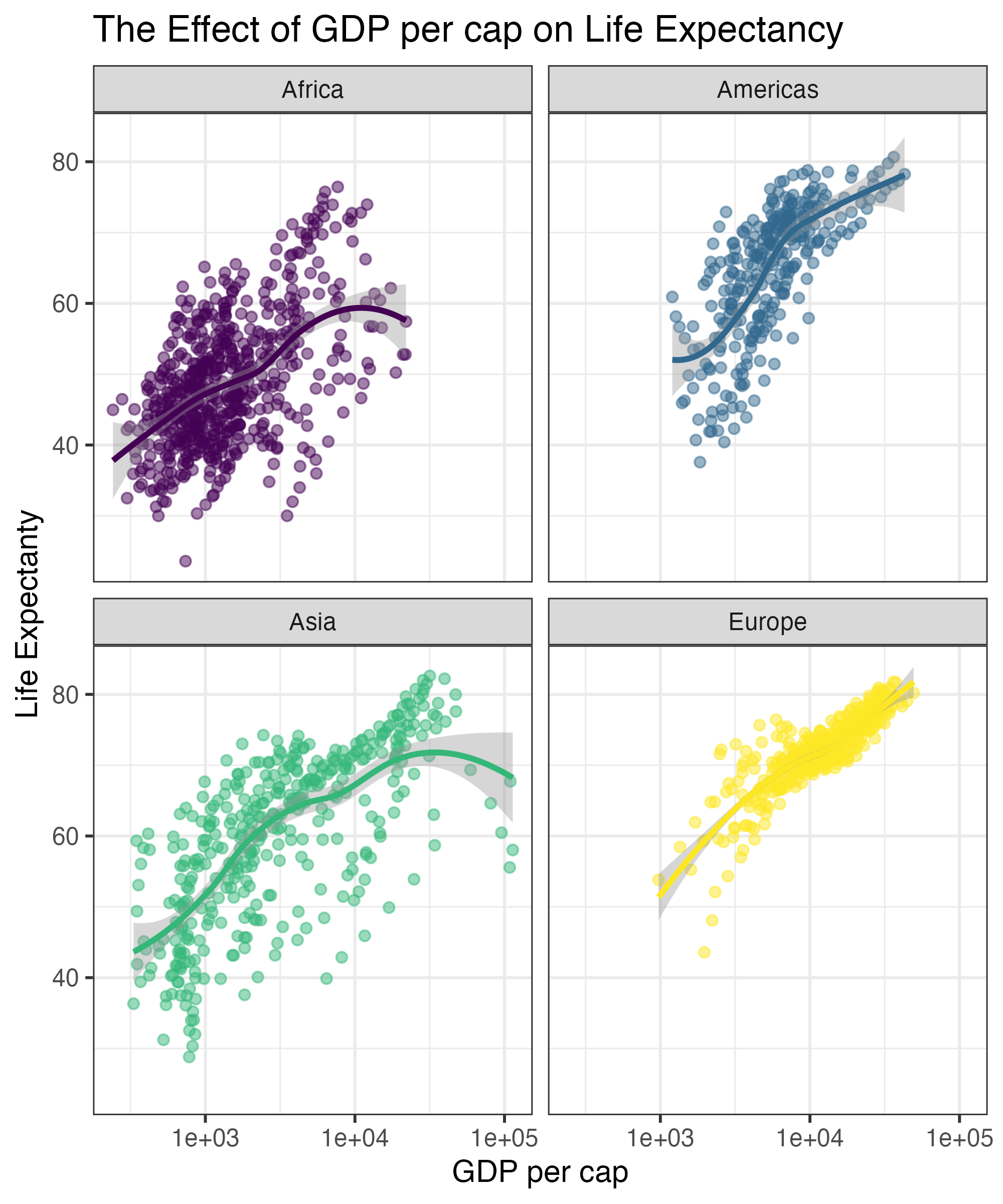
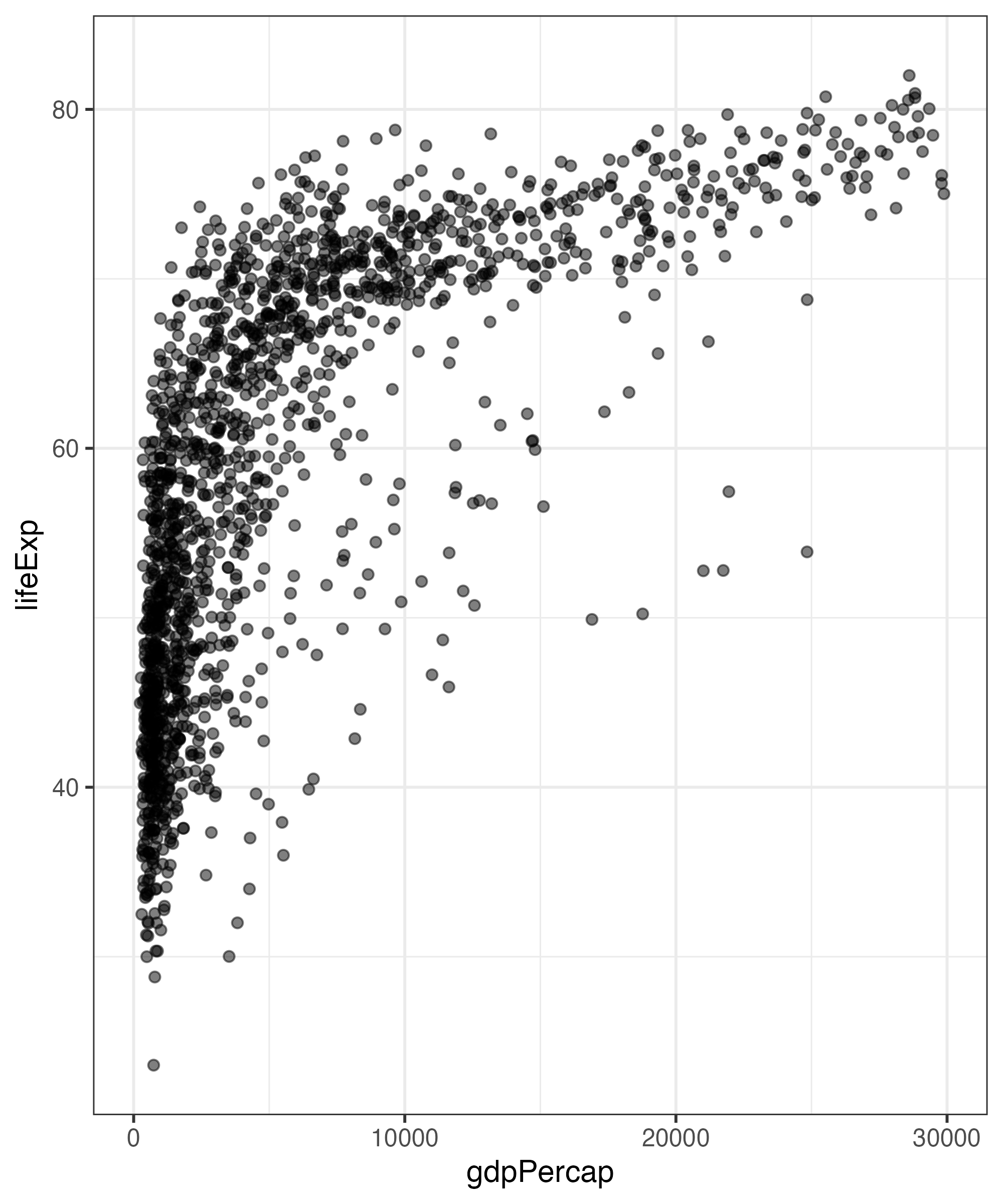
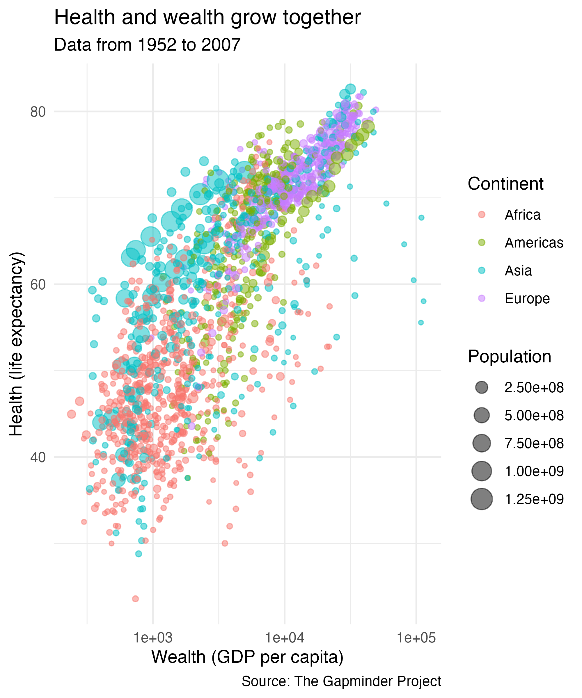
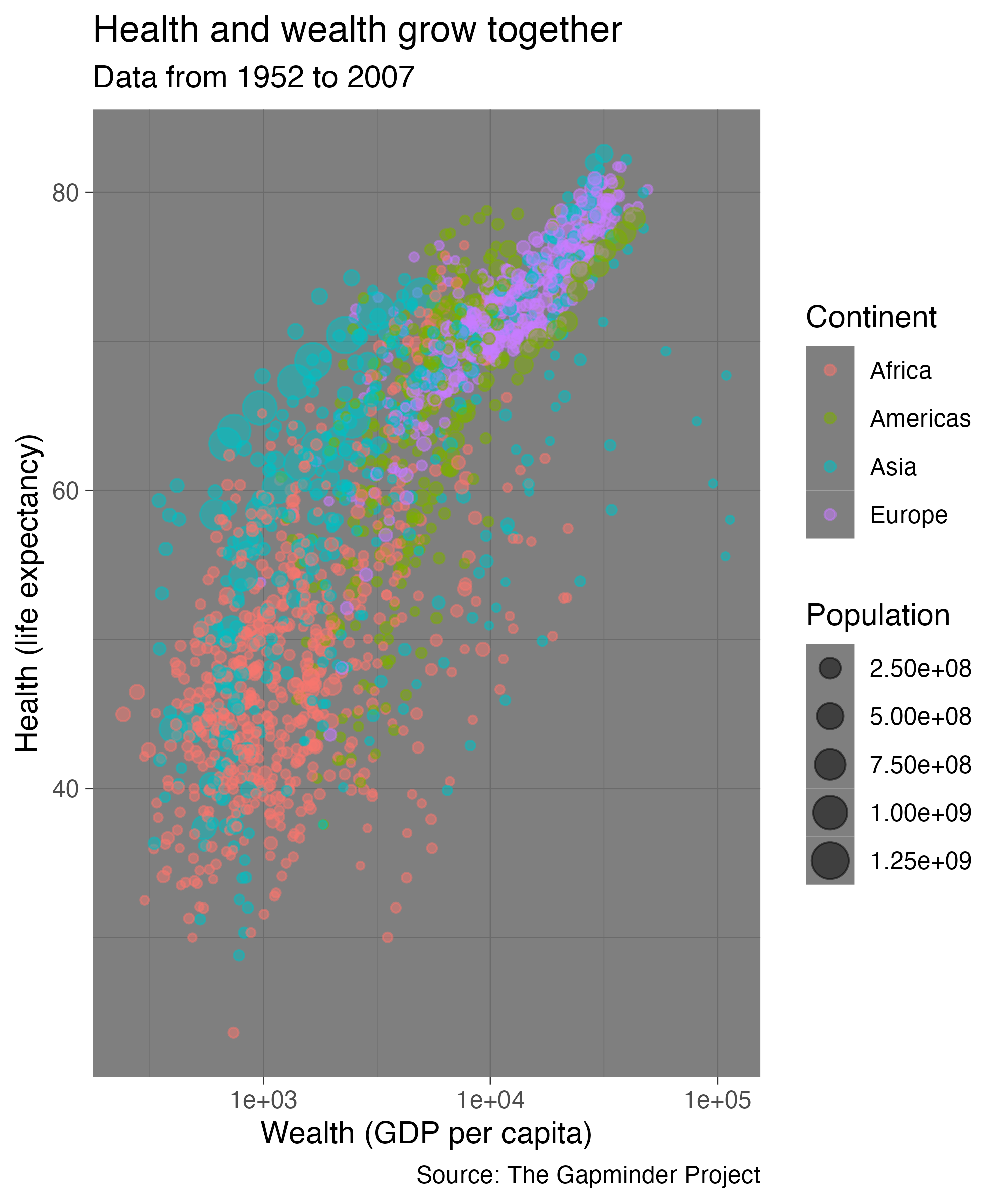
Scales in Action

Scales in Action
Scales in Action
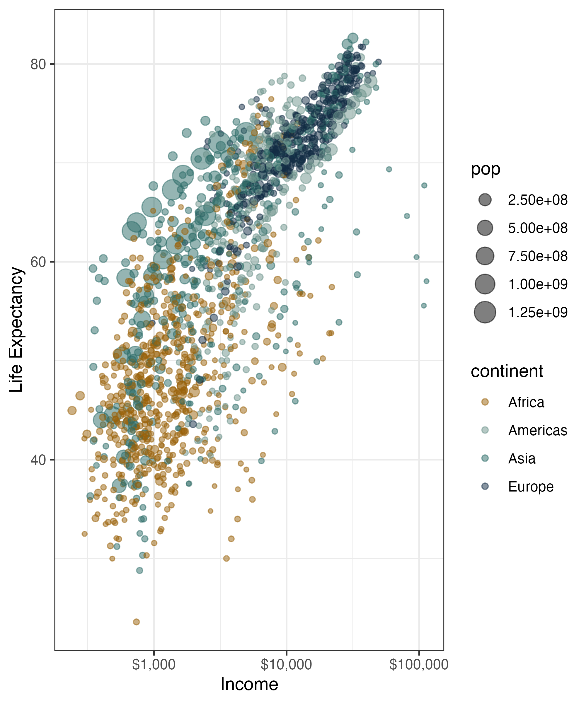
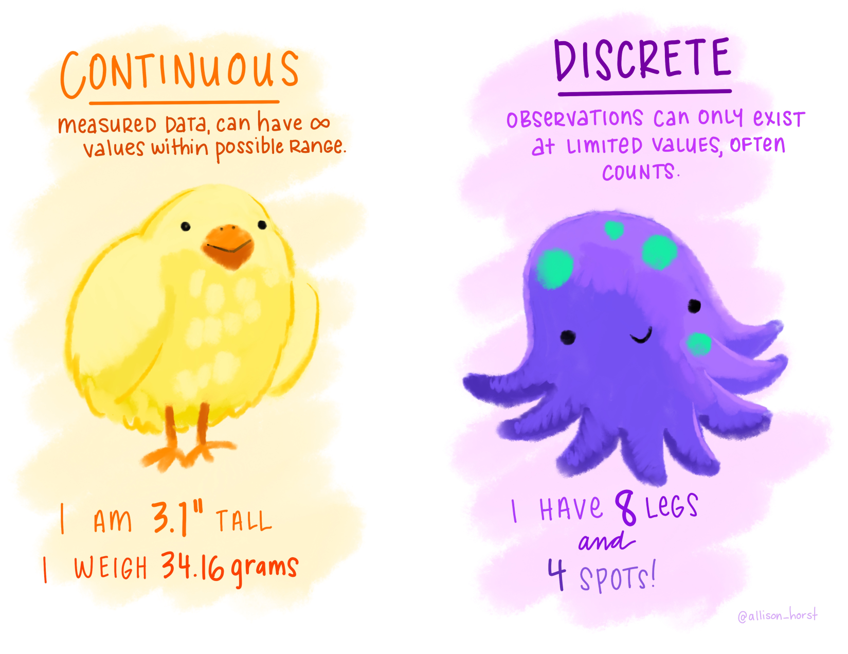
Illustration by Allison Horst
Scales in Action
Change the Limits of the plot
Circular Coordinate Systems

Your Turn
Change the colors of this density plot

04:00
How I Did It
facet_wrap
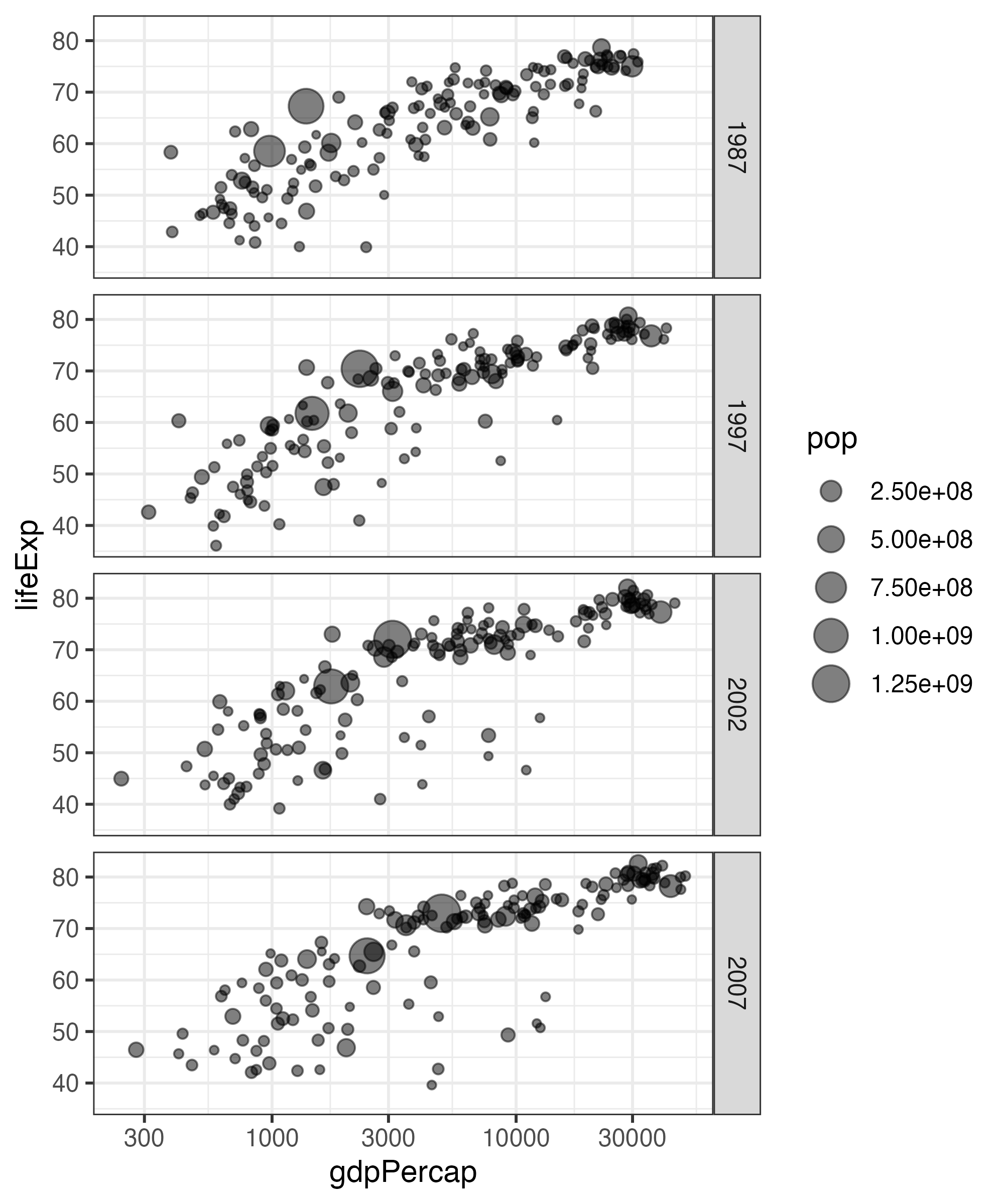
facet_grid
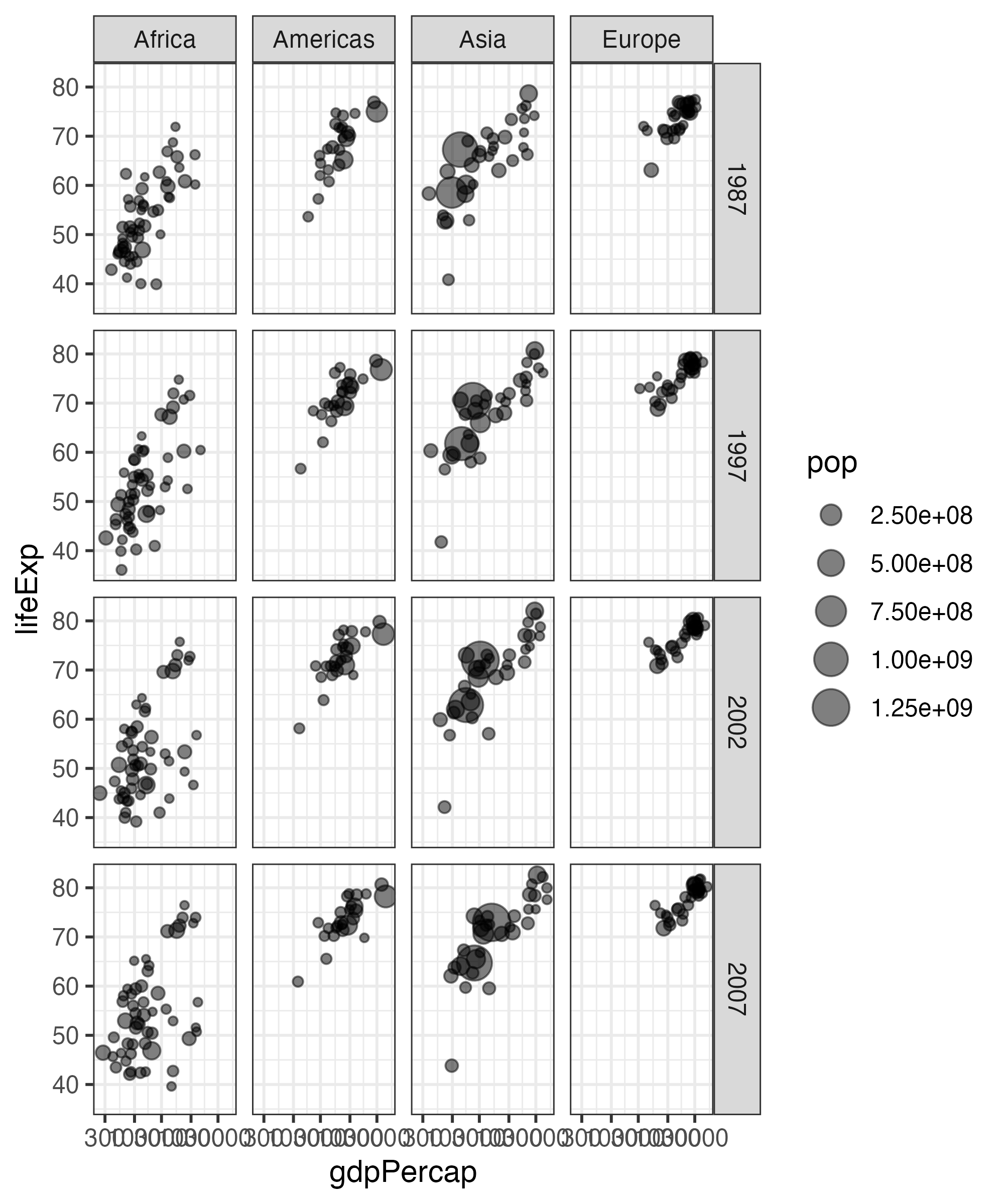
facet_grid
Labels with labs
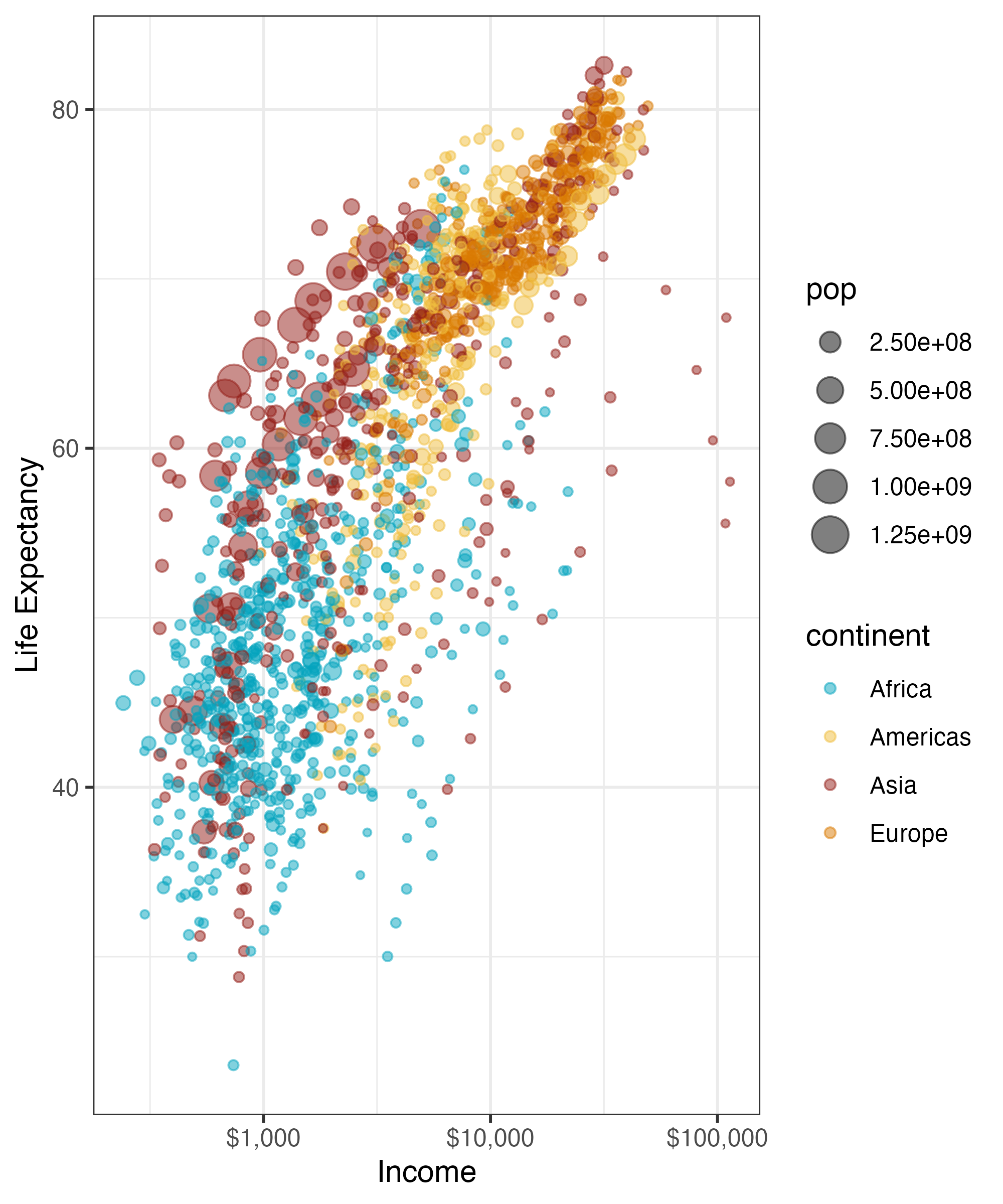
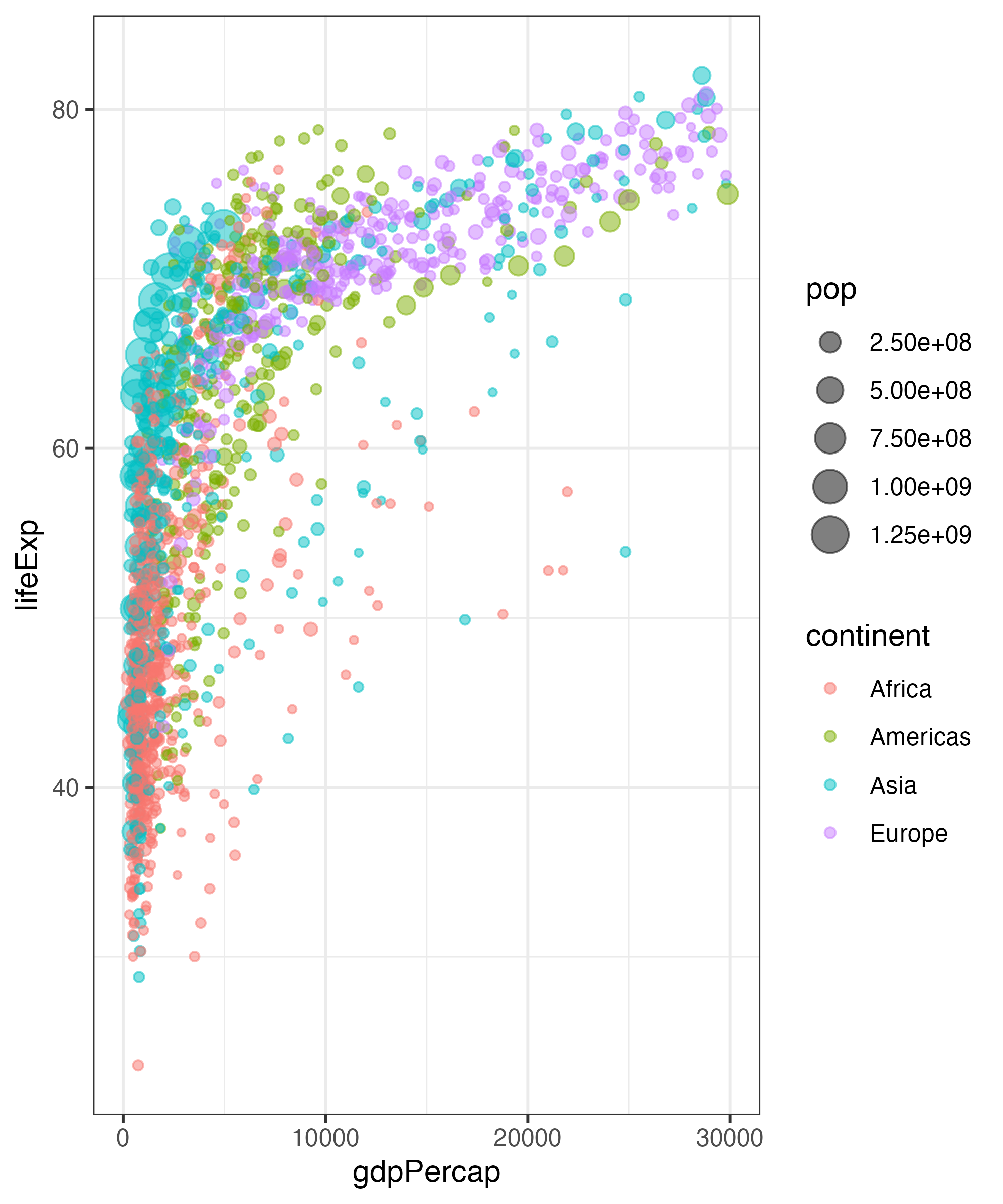
ggplot(gapminder,
       aes(x = gdpPercap,
        y = lifeExp,
        color = continent,
        size = pop)) +
 geom_point(alpha = 0.5) +
  scale_x_log10() +
  labs(title = "Health and wealth grow together",
       subtitle = "Data from 2007",
       x = "Wealth (GDP per capita)",
       y = "Health (life expectancy)",
       color = "Continent",
       size = "Population",
       caption = "Source: The Gapminder Project")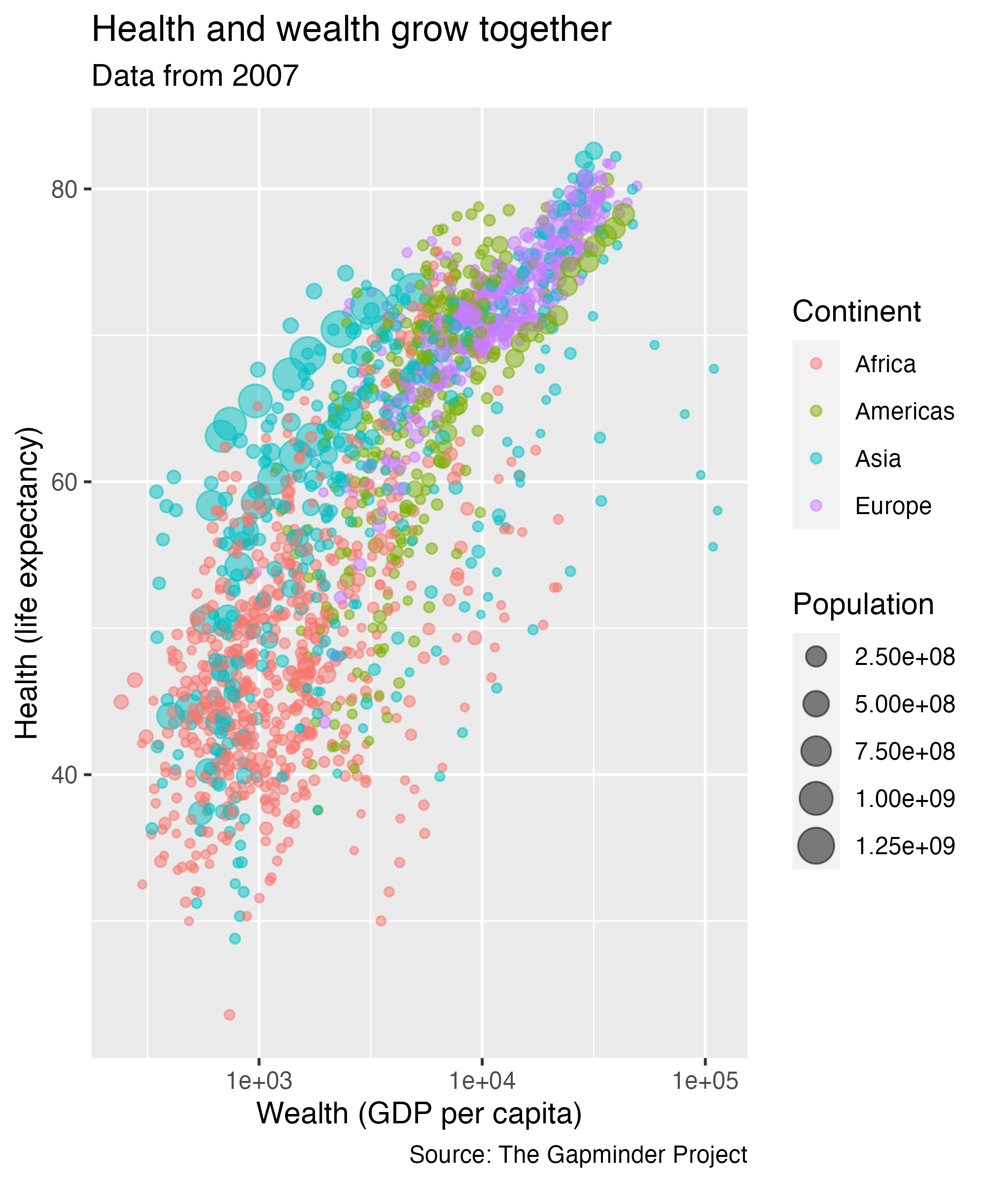
Changing the Default Theme
theme_minimal
theme_dark
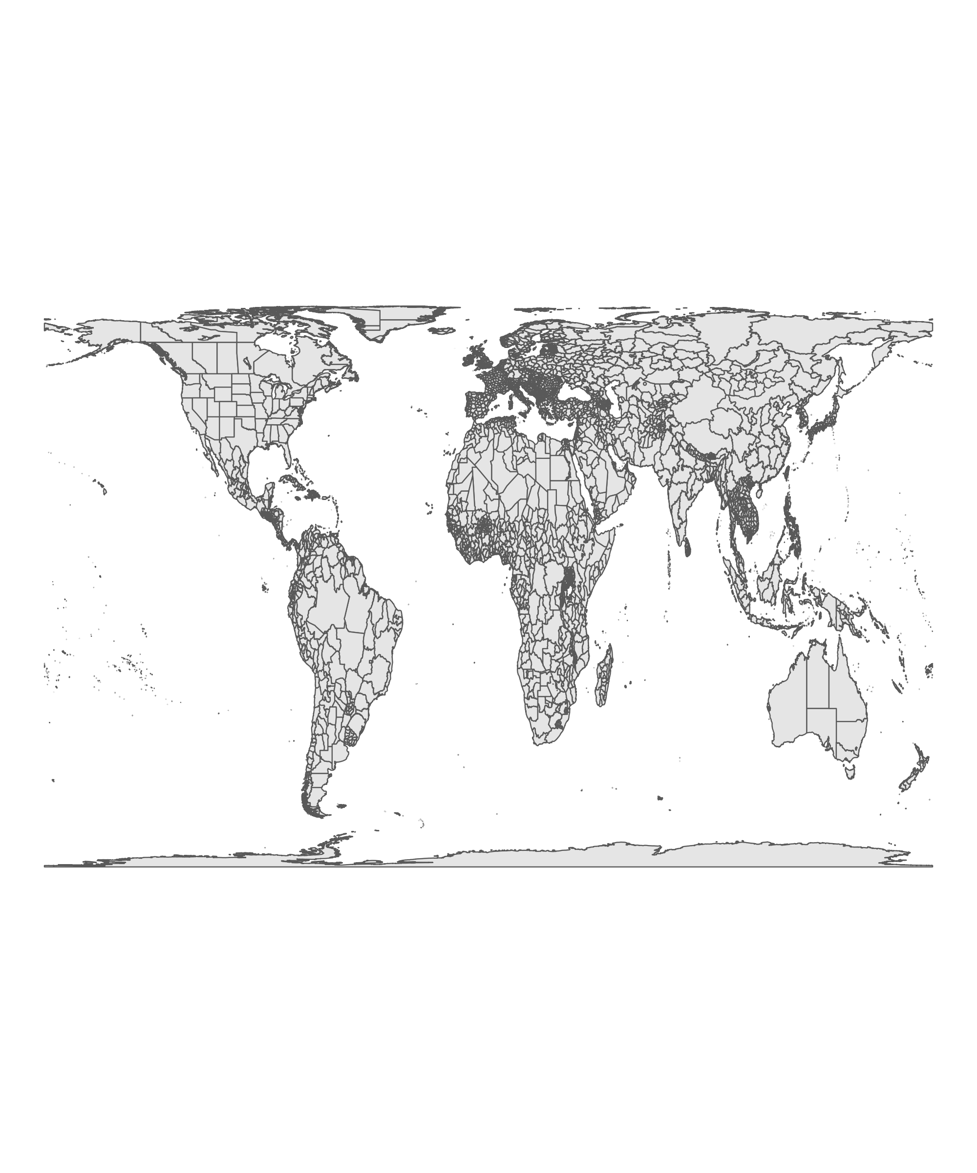
Map Made By Kieran Healy
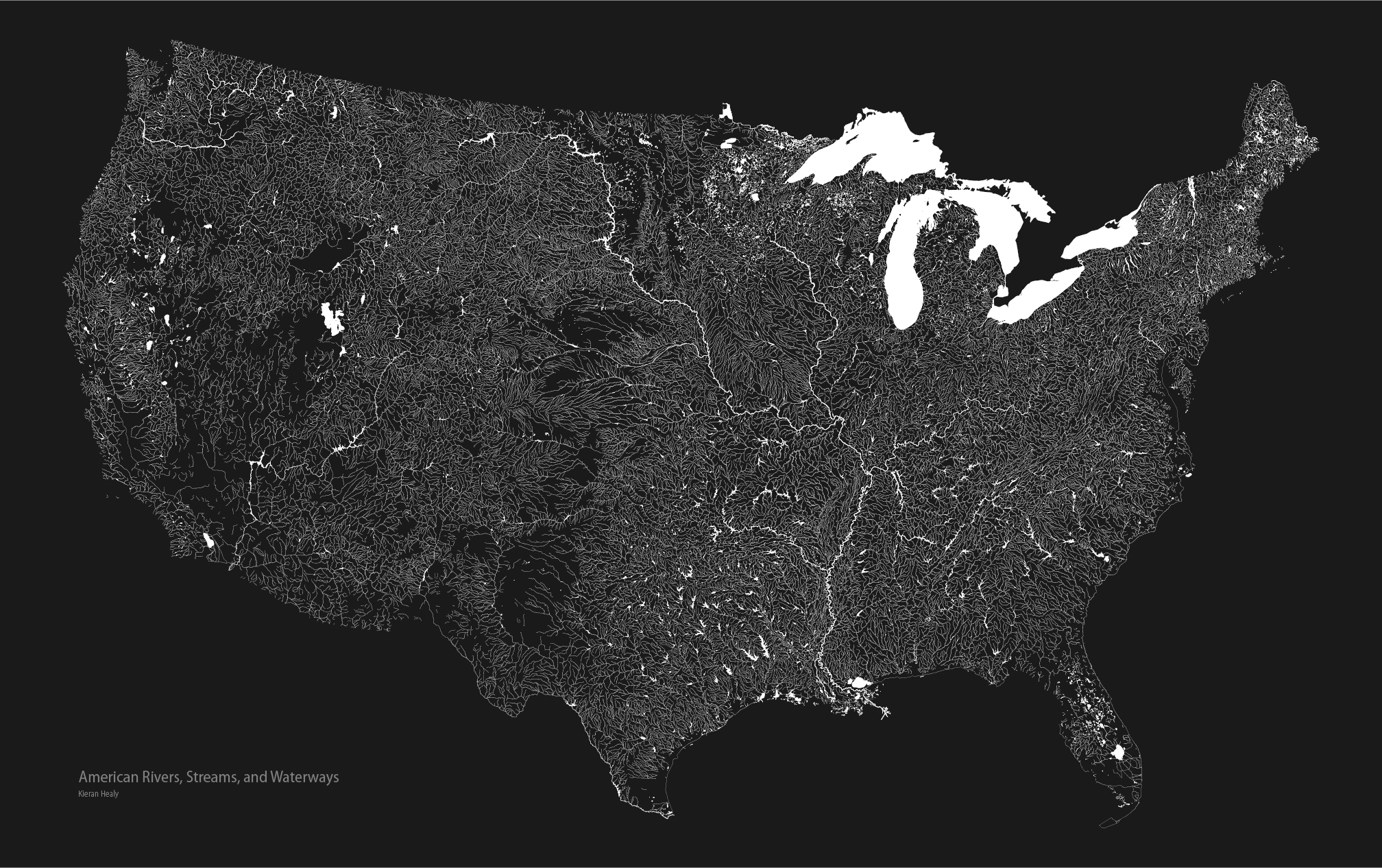
Making Maps in ggplot

Changing the Projections
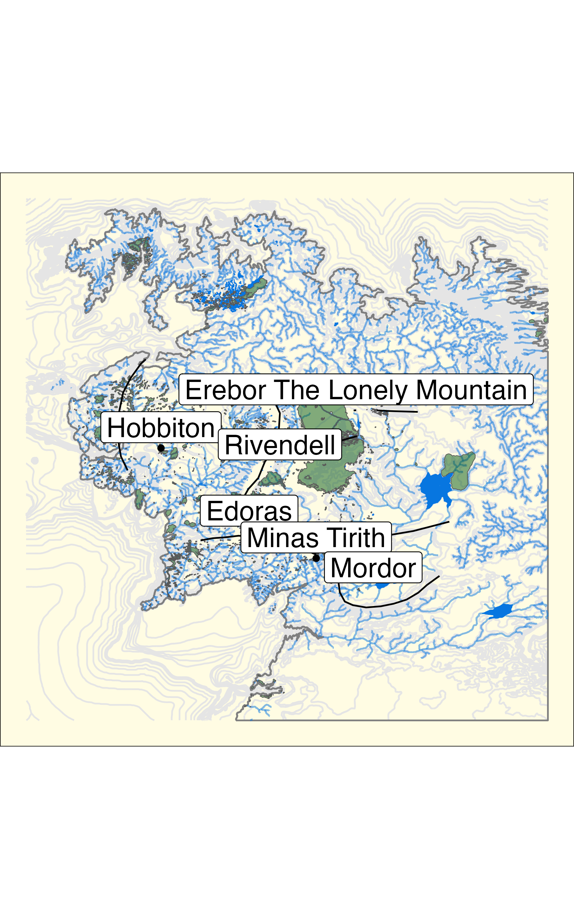
Mapping Middle Earth
# using some programming read in everything iteratively
# there is probably a simpler solution but this worked for me
shapes <-  list.files(path = "data/ME-GIS/", pattern = "*.shp", full.names = TRUE)

shapes_read = map(shapes, read_sf)

remove <- c("data/ME-GIS//", ".shp", "2", "02", "_18", "")
#https://stackoverflow.com/questions/29036960/remove-multiple-patterns-from-text-vector-r
shapes_names = shapes |>
  str_remove_all(paste(remove, collapse = "|")) |>
  str_to_lower()

names(shapes_read) = shapes_names

map(names(shapes_read), ~assign(.x, shapes_read[[.x]], envir = .GlobalEnv))

places = placenames |>
  filter(NAME %in% c("Hobbiton",
                     "Rivendell",
                     "Edoras",
                     "Minas Tirith"))

mordor = placenames[placenames$NAME == "Mordor",]

mountains_to_label = mountains_anno[mountains_anno$name == "Erebor The Lonely Mountain",]


ggplot() +
  geom_sf(data = contours,
          size = 0.15,
          color = "grey90") +
  geom_sf(data = coastline,
          size = 0.25,
          color = "grey50") +
  geom_sf(data = rivers,
          size = 0.2,
          color = "#0776e0",
          alpha = 0.5) +
  geom_sf(data = lakes,
          size = 0.2,
          color = "#0776e0",
          fill = "#0776e0") +
  geom_sf(data = forests,
          size = 0,
          fill = "#035711",
          alpha = 0.5) +
  geom_sf(data = mountains_anno, size = 0.25) +
  geom_sf(data = places) +
  geom_sf_label(data = filter(places, NAME !="Rivendell"),
                aes(label = NAME),
                nudge_y = 80000, size = 6) +
  geom_sf_label(data = filter(places, NAME == "Rivendell"),
                aes(label = NAME),
                nudge_x = 88000, size = 6) +
  geom_sf_label(data = mountains_to_label,
                aes(label = name),
                nudge_y = 80000, size = 6) +
  geom_sf_label(data = mordor,
                aes(label = NAME),
                nudge_y = -10000, size = 6) +
  theme_void() +
  theme(plot.background = element_rect(fill = "#fffce3"))